marca brasil
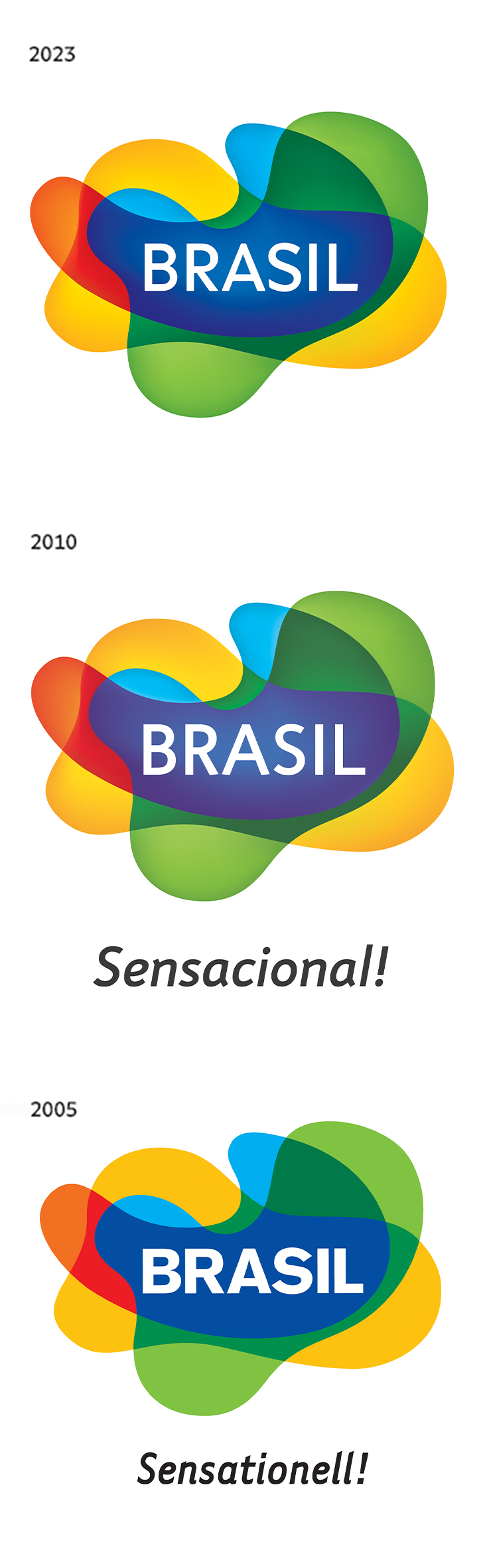
In 2005, Máquina Estúdio won a competition to create the visual identity for the Brazilian tourism sector abroad. Our winning brand was based on two concepts that convey Brazilianness: sinuosity/curve and transparency, which symbolizes the overlapping of cultures, a key element in the formation of Brazilian identity.
In 2010, at the request of Embratur, the brad was updated, adding volume and redoing the logo.
In 2019, during the Bolsonaro government, Marca Brasil was replaced by a new identity produced in a hurry, only to destroy what had been done until then. Fortunately, in 2023, as soon as the new government took office, one of Embratur’s first decisions was to bring back the identity in which a huge amount of resources was invested. We took the opportunity to correct small details and update the typography, created by Fabio Haag Type, a Brazilian company.